POLITIKEN HISTORIE
From a phone call to a benchmark

The Brief
Søren Nyeland, chief of design at Politiken, called me with an ambitious brief. They were launching a history magazine built around the popular podcast Kongerækken. I spent my apprenticeship with Politiken, and Søren knows me and my work. He wanted me to design the magazine, Politiken Historie.
When I arrived at Rådhuspladsen, Søren had a logo draft and a direction. The logo was solid, crafted by Peter Sætternissen, one of Denmark’s finest typographers. The rest was mine to figure out. Paper stock, grid, typographic system, colour architecture, cover strategy. We studied history magazines from across the world. The glittering popular titles and the sober heavyweights. It helped us decide on our direction, so I could get to work.
The system
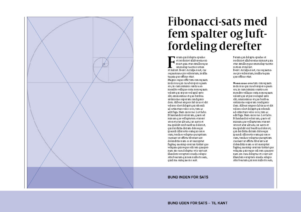
I built the grid on the Fibonacci spiral, slightly adjusted for a dense but easy reading experience at a compact format. It felt right for a history magazine. The proportions showed up in large pull quotes, in image overlays, in the spine. A quiet foundation that gave the whole thing coherence, carefully avoiding overdoing it.
For typography, I aligned the magazine with its bigger sibling. Politiken’s own Flama and Captolium News, in different weights. It saved countless hours of typography decisions, and the fonts are both beautiful and familiar enough to carry the brand, but distinct enough to stand alone. Pol Egyptienne appeared only in the logo and specific marketing material, giving it a weight no other element carried.
The result was a premium print product designed to compete with the best in Europe. I made it to be bold, tactile, and colourful – very much its own.


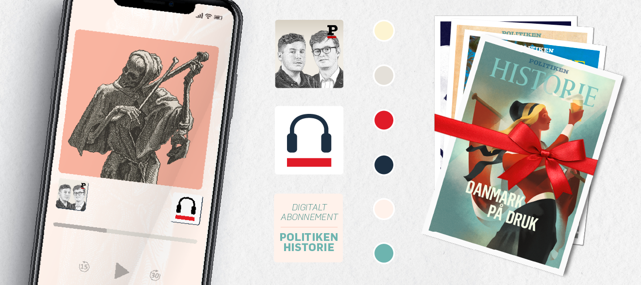
Beyond print
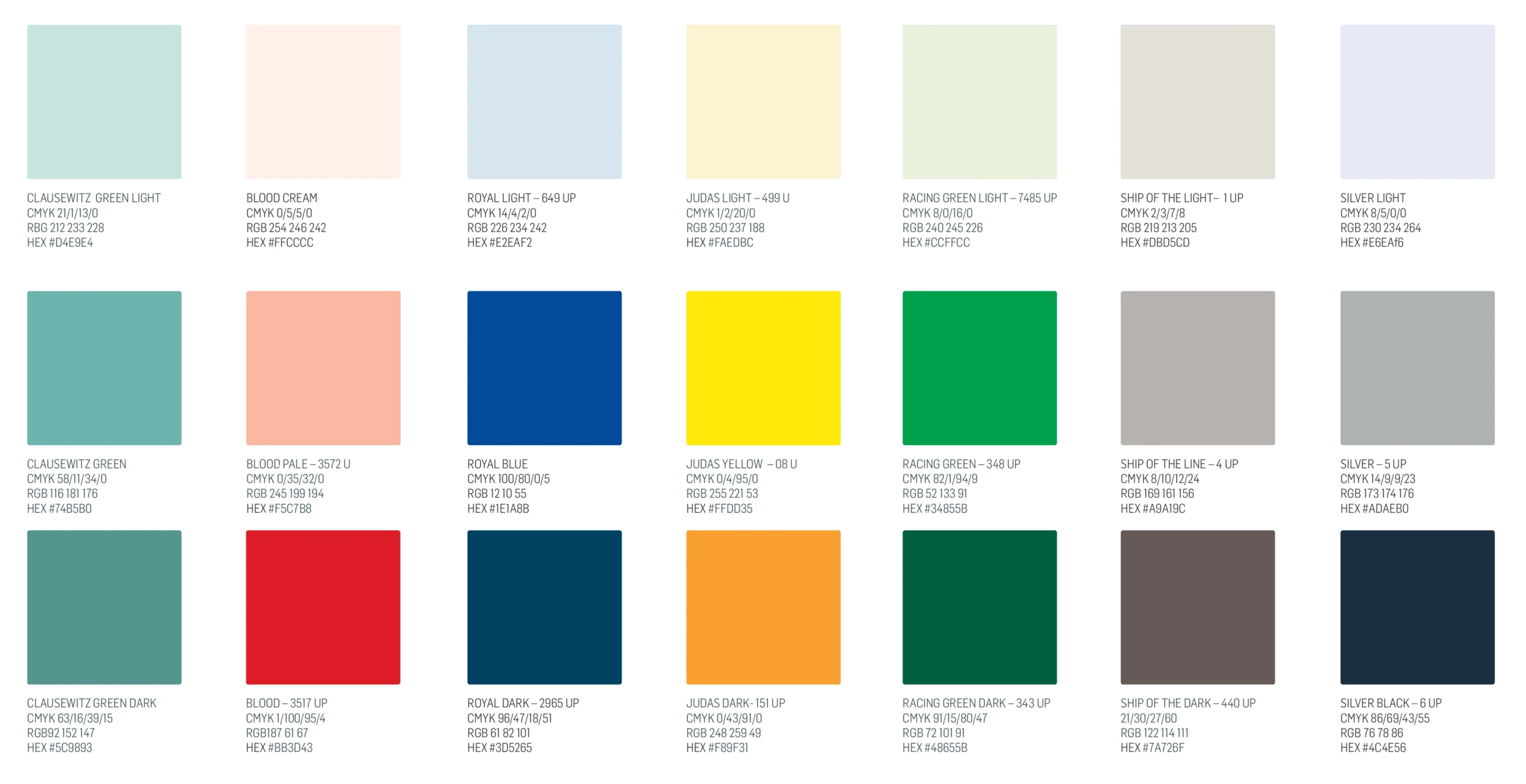
Potential readers would meet Politiken Historie before they ever picked up the magazine. Homepage, newsletters, OOH banners, SoMe, exhibitions and more. I designed the colour system to serve also as a brand guide ensured coherent identity across all touch points, both print and digital.
The artists
I realised early on that commissioned illustration could solve two problems at once: the recurring challenge of finding high-resolution visuals that matched our themes, and the opportunity to give the magazine a genuine creative signature. So I built a programme around it.
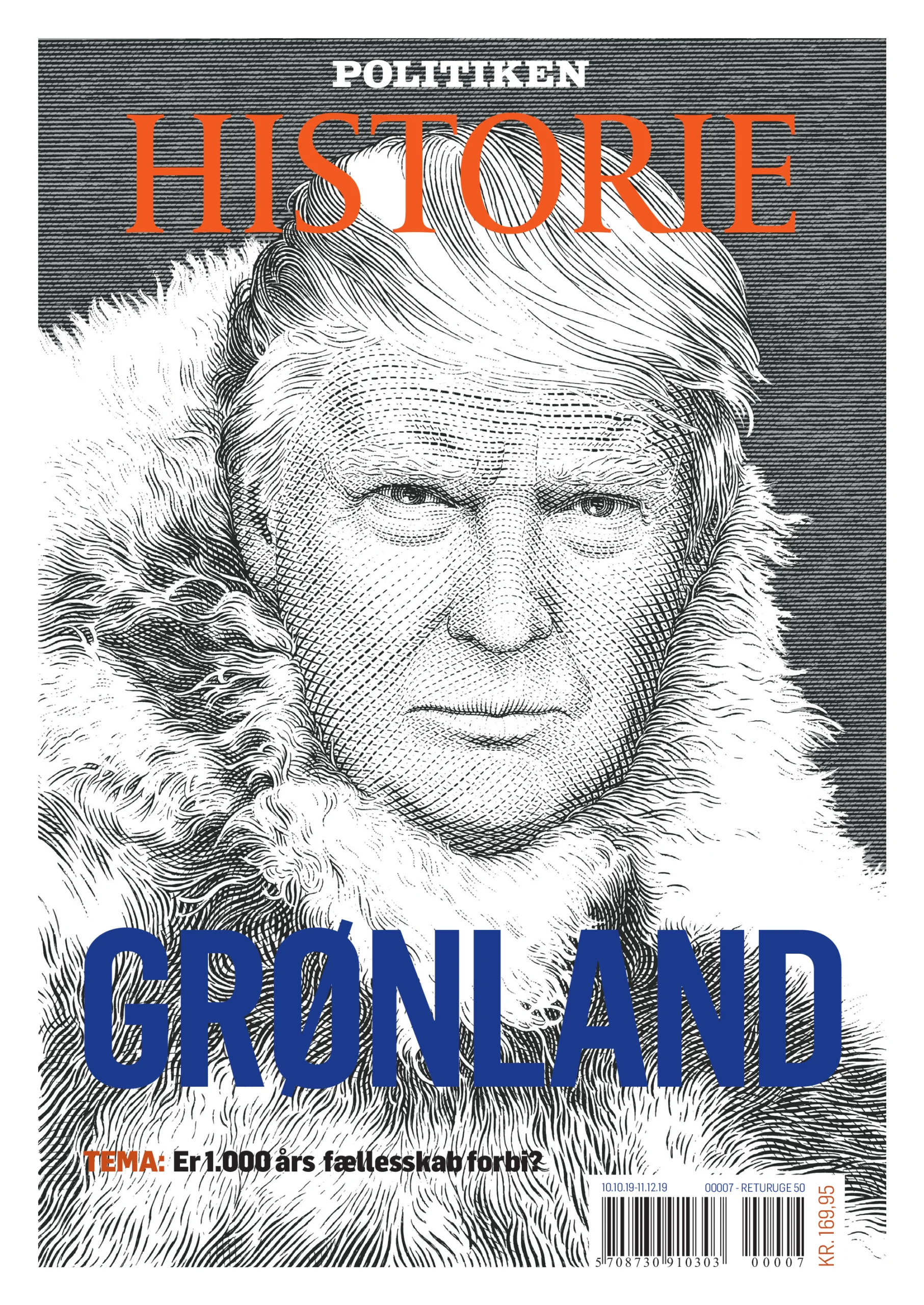
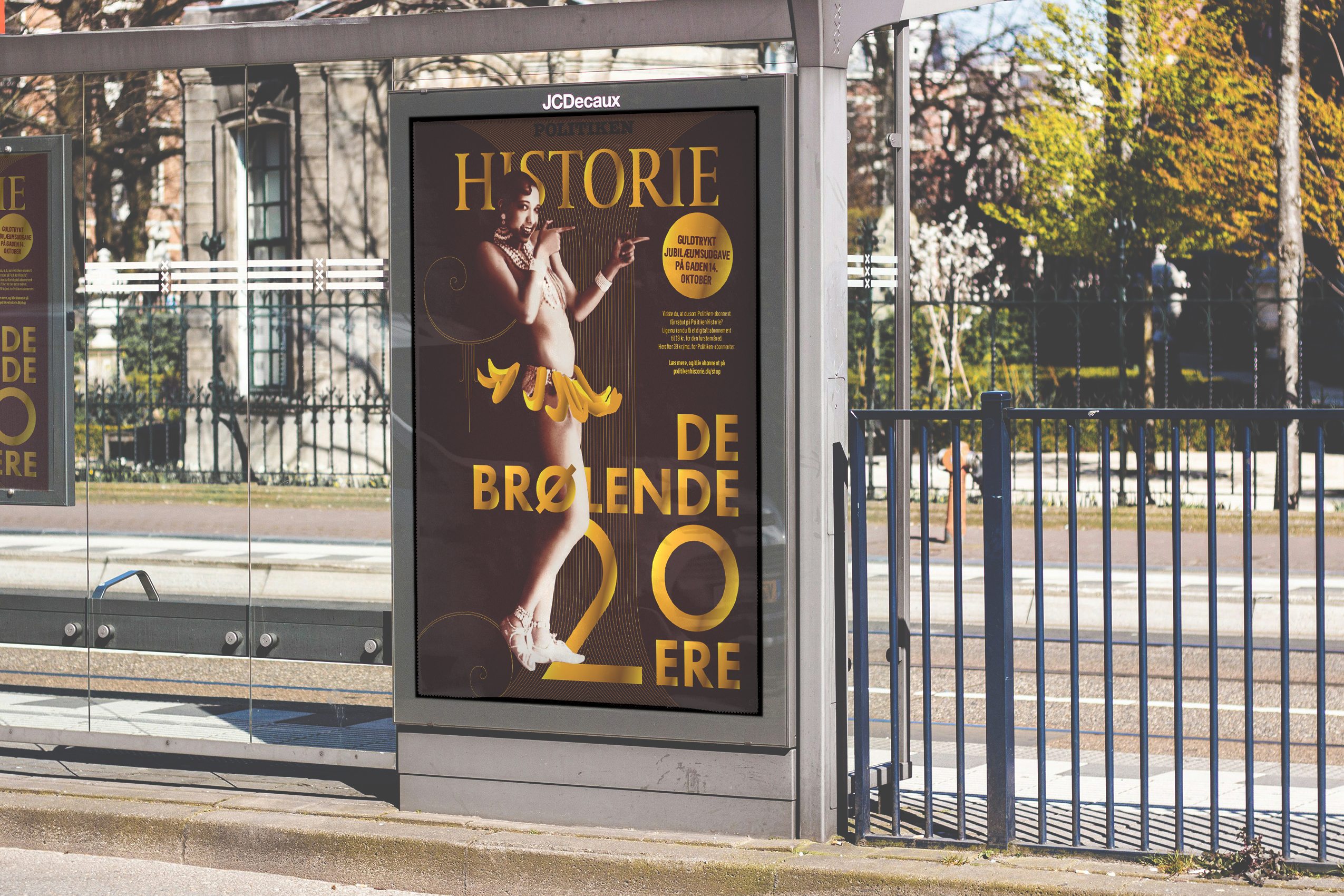
Together with Søren, I tasked Martin Mörck (who designed Denmark’s banknotes) with portraying Donald Trump in the anorak of legendary Greenland explorer Knud Rasmussen. Obvious and subtle at once. The cover turned out iconic, winning two awards.
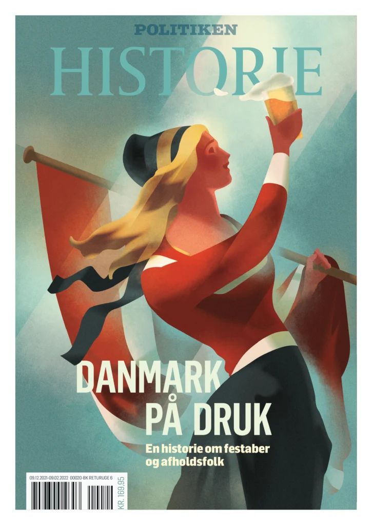
I asked Mads Berg to reimagine ‘Mother Denmark’, her sword replaced with a pint. It captured Kongerækkens tone perfectly: serious history, presented in a down-to-earth fashion.
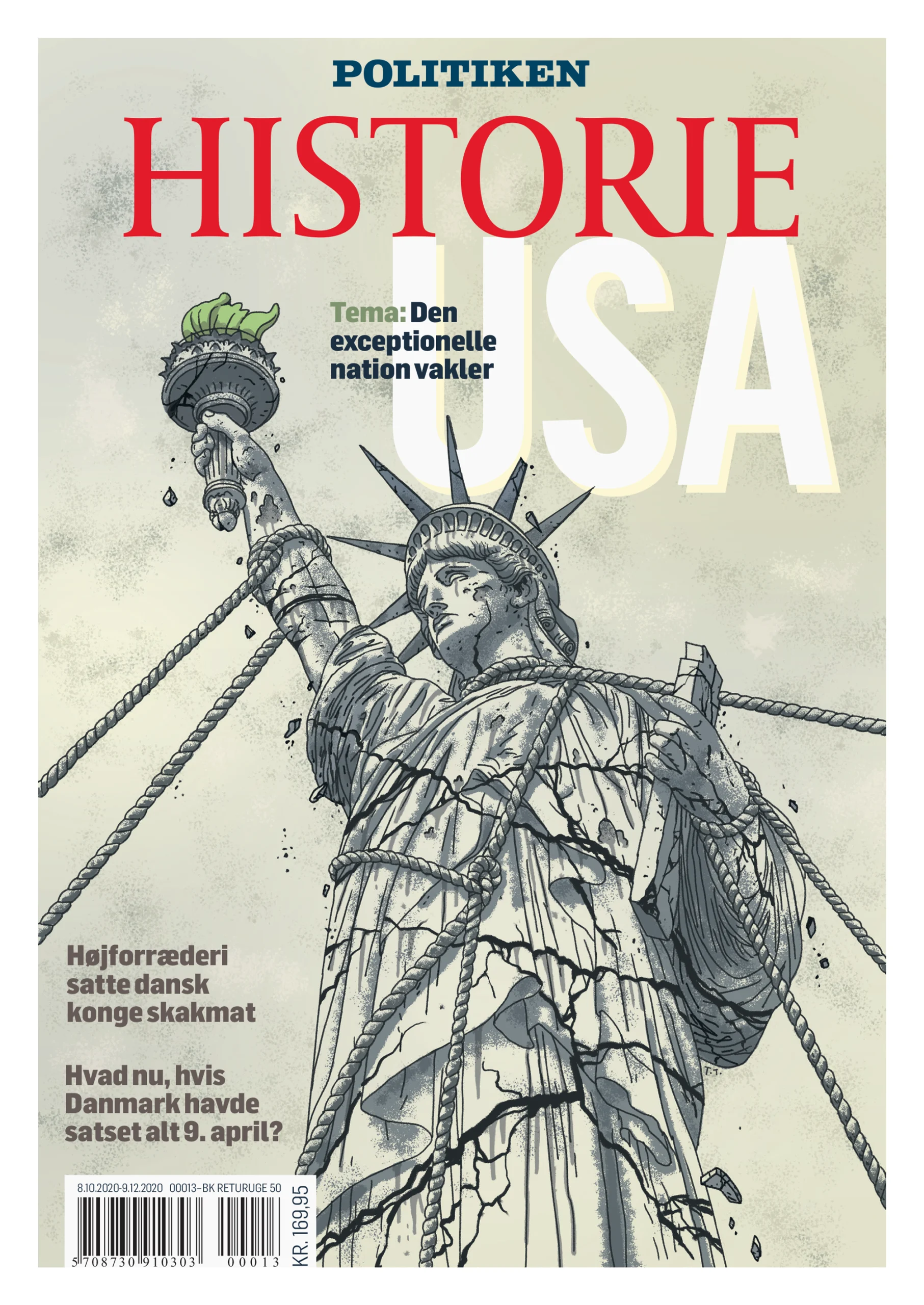
For a cover about America’s dominance under pressure, I brought in Thomas Thorhauge and asked him to reinterpret Metallica’s ‘And Justice For All…‘, only the Statue of Liberty in place of justice. The colour scheme I had built for the magazine lent itself perfectly to a cover with that much cultural weight.
When we needed a cover artist for the history of homosexuality in Denmark, I went looking for someone nobody in Denmark had worked with. I found Sofie Birkin. I found her work to be queer, powerful and completely her own. Her clients include Nike, Playboy, Google and Meta. She was the right person for the job – and for this particular cover, the only person, really. I never got the chance to be part of her work, but her cover was marvellously directed by Art Director, Caroline Niegaard, who took over the reins when I moved on.
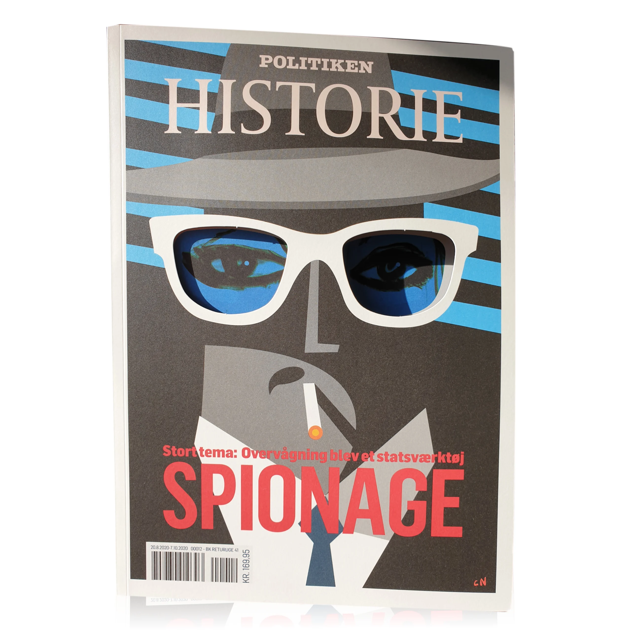
The spy cover
At a planning meeting for our espionage issue, editor in chief Anders Olling joked that we should cut holes in the cover: like the spies hiding behind newspapers in Donald Duck. He laughed it off, dismissing the idea as perhaps too childish. I thought it had great potential.
A throwaway joke in a morning meeting. A die-cut cover, a hidden cover reveal, and a campaign that put the magazine in front of people’s faces, quite literally.
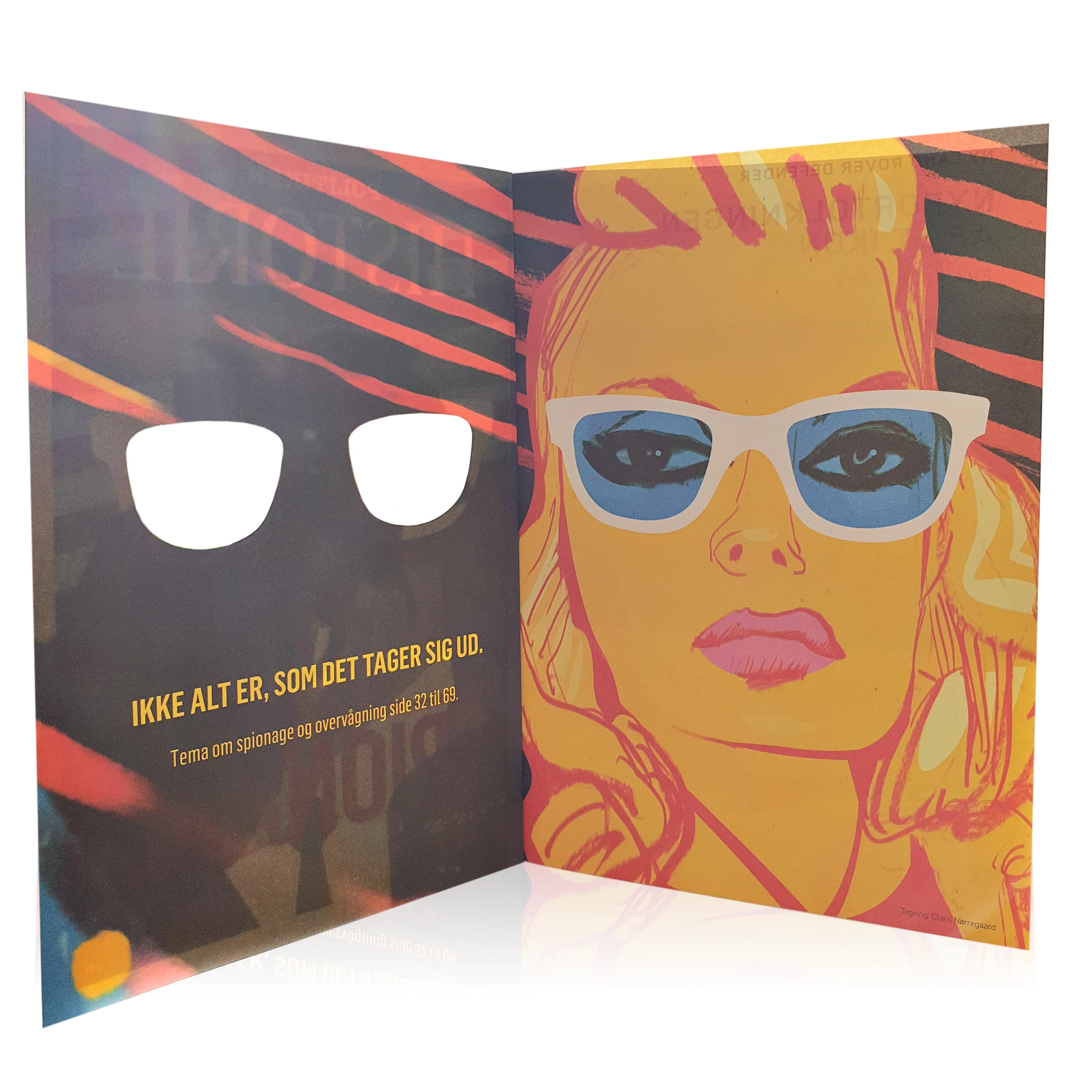
I commissioned Claus Nørregaard to illustrate a spy on the cover: hat pulled low, collar turned up, cigarette, blue-tinted glasses. Cold colours, very undercover, but something slightly off with the eyes. The glasses were die-cut holes, but you wouldn’t know it unless you looked closely. The cover held its secret.
But when you open it, the true identity of the agent is revealed: A woman looks at you and next to her (on the back of the cover) it reads: Ikke alt er, som det tager sig ud. (EN: Not everything is what it seems). She’s wearing the same glasses. The colours shifted to warmth, but still a serious agent, inspired by Charlize Theron in Atomic Blonde. The holes in the cover align perfectly with her eyes. Hold the magazine up in front of your face and you’re wearing her disguise. You’re undercover. Nobody will ever suspect a thing.
The figure on the cover reads as male, but I wanted the real agent to be a woman. In a magazine where the archive photographs featured almost exclusively dull men in grey suits, she was hiding in plain sight on the very first page.
We turned it into a SoMe campaign: Take your best covert shot, tag us, win great things. We had so much fun going over these – they were hilarious.
When the history of espionage was done, I had turned a throwaway joke in a morning meeting into a die-cut cover, a reader participation campaign, and smuggled in a female spy into the magazine through a pair of white-framed glasses.
What it became
The magazine evolved through its first year deliberately. We let the identity sharpen through making, rather than locking it all down upfront. This told me, that readers loved the bold, premium design. And despite its broad strokes, the identity shone very much on its own. It felt like the podcast had been pressed onto extraordinary Munken Pure paper with the utmost care.
The covers won Awards of Excellence for concept, idea and storytelling. The distinctive visual style lit up the large format banners at Rådhuspladsen and several other, prominemt placements in central Copenhagen. And then one day, we realised that History Today, the title we had looked to for inspiration when we began, had started looking back at us.